- Get link
- X
- Other Apps
- Get link
- X
- Other Apps
The return of Superboy.

Written by Brian Michael Bendis, Pencils John Romita Jr.
So after taking a look at Batman #92, I felt it would be fun if I also took a look at a Superman comic. After browsing through some of his most recent books, I settled on this issue of action comics for its premise. It focuses on reuniting Superman with the Conner Kent Superboy from Young Justice, a series I really like though have admittedly stopped reading due to me being so busy as of late. So, how do Superman and Superboys first meeting since Rebirth go? How is Brian Michael Bendis handling Superman as of late?
Let's dive in.
The book opens with Conner and Superman at the fortress of solitude, trying to make sense of it all. Superman doesn’t remember Conner, while Conner himself is uncertain about his own origin with the earth having been ‘rebooted’ so many times before (a plot-point explored further in Young Justice). Their little talk is interrupted when John Ken & Brainiac 5 from the Legion of Superheroes come back to the past through even they can’t tell who Connor is. Together, the four-try and figure out the truth behind the whole situation. Meanwhile, over at the Daily Planet, Perry White has called in every employee in his office for an emergency meeting. After the recent revelation that the Daily Planet owner is a criminal, its future is uncertain and many of its employees are shaken. To hopefully help the Planet of its current predicament, Lois and Jimmy check out a tip from an anonymous source but walk into a trap instead.
So after I finished reading this issue, I immediately read it again. And again. And again. Not because I liked it so much that I wanted to experience it again immediately, but because I didn’t really know what to make of it. That brings me to my very first point: this book feels very messy. Not just because of the artwork, which I’ll get to later, but the pacing and writing as well. The A-plot jumps to around three different places, each of which happens rather sudden and is accompanied by a lot of dialogue. These three factors contribute to me personally feeling a bit overwhelmed and having trouble keeping up with every development. It’s why I reread the issue 3 times, it just took me that long to understand everything. This might be a very personal problem, something that other readers might not have, but I just had to mention it regardless.
Moving on from this personal annoyance, let’s focus on writing and art. The writing in this issue is really good. Even though There’s without doubt too much text in the book, many pages are just cluttered with text boxes, that doesn’t change the fact that the writing is really competent. The banter the characters have is often witty and always enjoyable and the characters each have a distinctive ‘voice’ to them which is especially helpful this time around. I was especially relieved to see that Bendis has, at the very least, Superman’s characterization down. That might not seem like much, but I’ve read through enough New 52 in my life that I praise a well-written Superman at any chance I have. True Superman fans will definitely agree with me on this one and I think they will also quite like the direction the story seems to be taking. Bendis is clearly weaving the pre-New 52 status Superman-family back in alongside the new stuff like John Kent and I have to admit I’m very much looking forward to it. The promise this issue sets for the future of the Superman books is promising is what I’m trying to say.
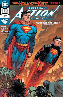
The art is where the issue is at its worst. The artwork has a sketchy feel to it, with characters and background having a lot of extra lines near their edges, but that isn’t the problem really. The problem is the proportions, the postures and the faces. The proportions and postures just feel very unnaturally. The perfect example, which you can easily see on the cover, is Superman. He’s so stretched out here and it’s just very uncanny and distracting. The faces aren’t different enough and, worse of all, look like plastic. I know that drawing distinctive faces is one of the most difficult things when it comes to art, but when 3 of you 4 main character have the exact same hair and eye colour it becomes very difficult keeping them apart. The plastic effect doesn’t help here either as they not only look unnatural but keeps them from emoting. In short: the writing is very good while the art really isn’t.
 |
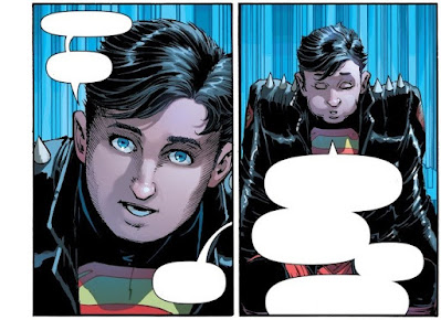
| These panels are a good example of the plasticy faces and the amount of text bubbles. |
Lastly, I want to give some time to the B-story, which I found quite enjoyable. We only jump to it three times, two of which are rather brief, but I found them very effective. It builds on what, I assume, Action Comics main storyline and I feel it does so effectively. I haven’t really read the run lately, but I got a good sense of what had happened and what direction it's going. The B-story gives this issue some much-needed breathing room while simultaneously being good on its own.
Conclusion
To round off this review: the issue has some good moments. The story seems to be going in a very emotional direction and one which long-time fans will definitely like, but overall it feels very messy to me. The writing is good, the art is outright bad but the story has a lot of promise and the characterizations of the characters are solid. If you can get past the art and the amount of text in this issue, give it a read. If not, I’d skip it.

Comments
Post a Comment
Liked what your read? Want to join the discussion? Why not leave a comment! If you do, keep it civil and respectful. No bad language here!